Our labour market statistics are generally offered as time series. We plot them out and try to discuss what is happening in people lives. I always find this horribly unsatisfactory, because I care about what happens over one’s entire lifetime.
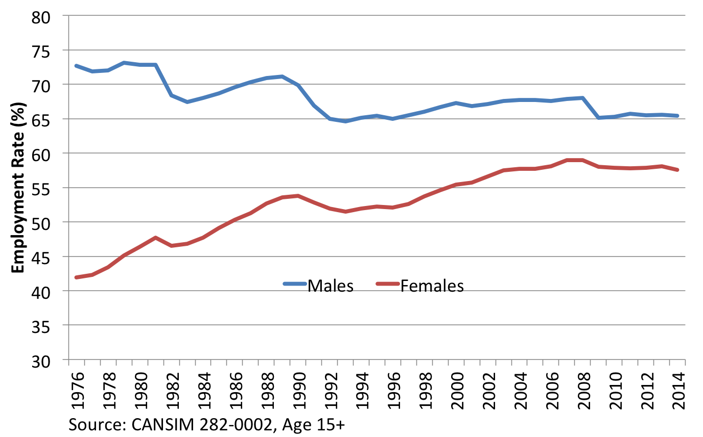
For example, we might see trends in employment rates (15 and over):
When summarizing what happened since 1976 we can highlight the business cycle and what appears to be serious declines in men’s employment rates. For women, steady increases in employment continued until the past few years…
The problem is, these general trends are not just describing the state of the labour market. The trends are also capturing the changing demographics of the population and differences across generations (birth cohorts) in how we organize our lives.
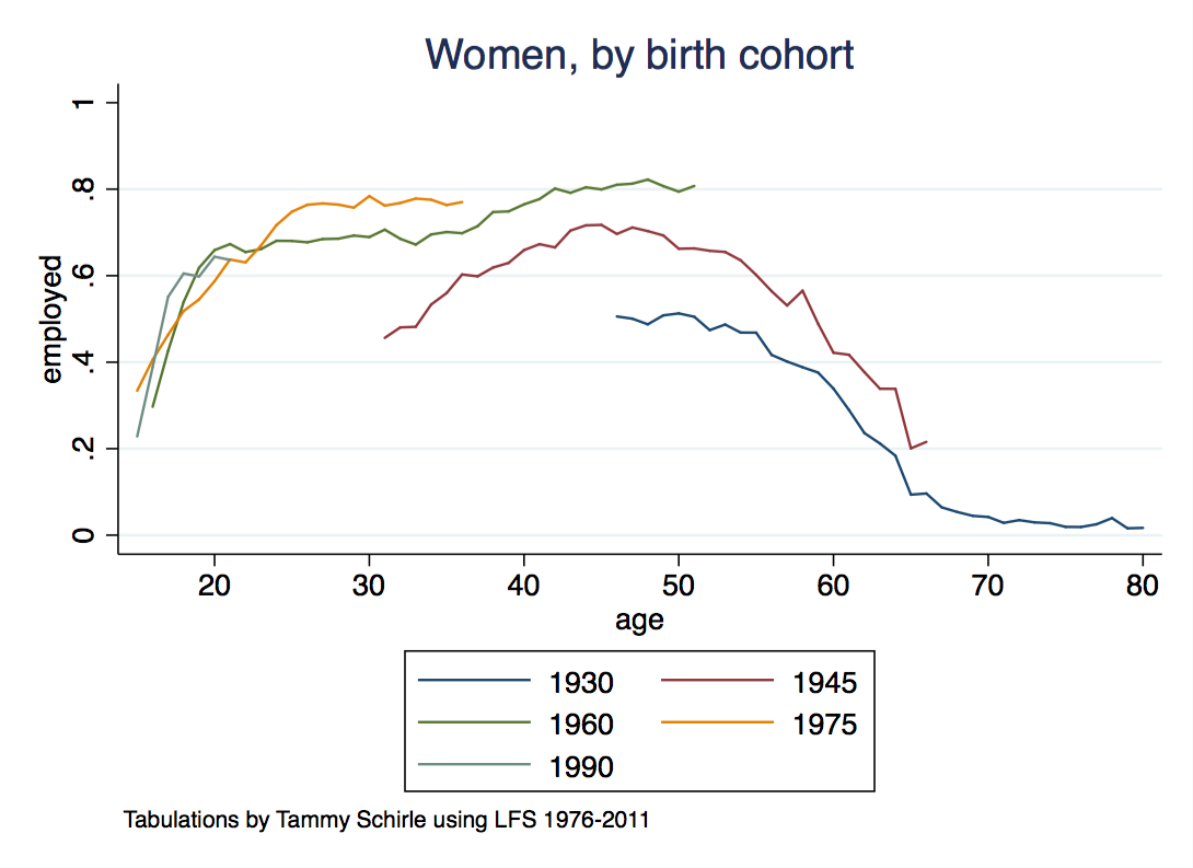
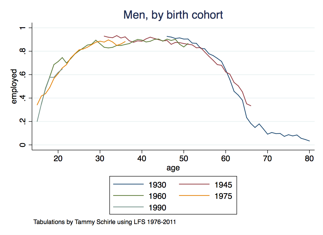
For that reason, I like looking at age profiles by birth cohort. This describes more directly what people are doing over their lifetime:

The differences across cohorts of women are incredibly stark – each successive generation of women has worked more than the one before. We still have to see what happens with those born 1990, they are just finishing school and starting their careers, but already appear to be working as much or more than generations of women before them. Recent time series indicate that women’s employment rates are stabilizing, but that’s not clearly the case for recent cohorts. Rather, the time series in part reflects the weight placed on baby boomer cohorts now sitting around ages 55-65.
The differences across cohorts of men paint a much less dramatic picture than what we saw when plotting simple time series. You can see the 1960 cohort get hit by the recession in the early 80s and again in the early 90s. You can see some differences in retirement patterns, and youth (education matters). But otherwise…I don’t see each generation of men working less than the one before.
Hm. The title was a bit deceiving.


