Lord Kelvin said,
[W]hen you can measure what you are speaking about, and express it in numbers, you know something about it; but when you cannot express it in numbers, your knowledge is of a meagre and unsatisfactory kind; it may be the beginning of knowledge, but you have scarcely, in your thoughts, advanced to the stage of science.
Last month, I argued that
If [Canada is] serious about improving the value we get for a health care dollar, the first order of business is accurate measurement of health outcomes and health care quality. Without accurate and detailed benchmarks of national health, we can’t give credible answers to the question of whether our health policies are working.
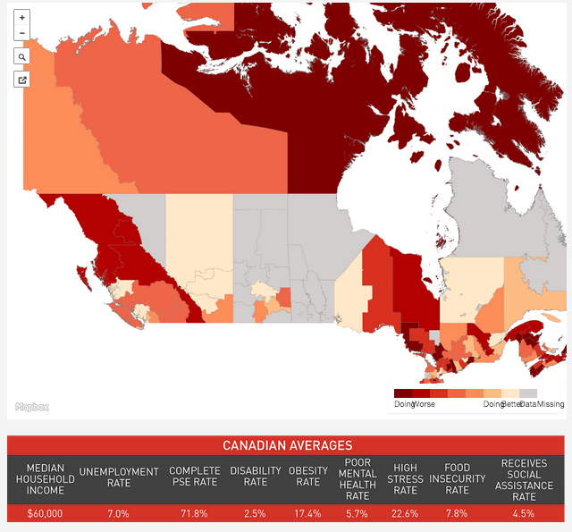
Here’s a case in point (see also the Globe and Mail). The Mowat Centre wanted to « explore the geographic dimensions of inequality and well-being in the country by comparing Canada’s 293 Census Divisions across nine social and economic indicators. » So they set about creating a map to depict how these regions were doing on basic indices of human well being.
This is the map they produced:

The dark red end of the spectrum identify regions where people are doing worst and the yellow end regions where they are doing better. It’s really informative except… what are all those grey areas? Those are regions where the data were so poor that the Mowatt Centre analysts couldn’t calculate their index.
One reason is that the quality of Canadian census data has declined.
using the census to obtain local, reliable data has been made increasingly difficult following the replacement of the mandatory long-form census with the National Household Survey (NHS) in 2010. The voluntary nature of the NHS has decreased the response rate from 93.5 per cent to 68.6 per cent, with the biggest drops occurring in smaller communities and rural areas. The result is poorer quality data and higher ”˜suppression’ ”” the exclusion of data due to higher non-response rates.
Even worse,
Non-respondents are also more likely to be individuals who face greater disadvantage, for example Canada’s Aboriginal people, and those who would benefit the most from the public services that census data could support.
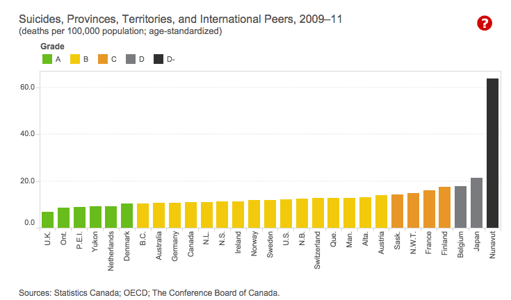
Why does this matter? It matters because, as Scott Gilmore wrote in MacLean’s, Canada has a race problem of huge inequities in well-being, as bad as the United States. You don’t believe Gilmore? Read Martin Patriquin on Pikangikum, Ontario, which may be the community with the highest suicide rate in the world. Or maybe Nunavut has that ghastly title. Here is a graph from the Conference Board of Canada, comparing suicide in Nunavut (the bar on the far right) against other provinces and other countries.

Gilmore points out that we don’t see Canada’s race problem
because our Fergusons are hidden deep in the bush, accessible only by chartered float plane: 49 per cent of First Nations members live on remote reserves. Those who do live in urban centres are mostly confined to a few cities in the Prairies. Fewer than 40,000 live in Toronto, not even one percent of the total population of the Greater Toronto Area. Our racial problems are literally over the horizon, out of sight and out of mind.
Canada’s race problem is invisible unless we travel to these remote communities or we systematically measure these problems. That’s the first step in holding ourselves accountable to solving them.
The multiple challenges facing aboriginal and other disadvantaged communities in Canada won’t be solved by better data alone. But we can’t act wisely or effectively without accurate data on health and well being.


