


The World Economic Forum defines our time as the fourth industrial revolution, when “data will rule in a world where nearly everyone and everything is connected in real time.” Yet an increase in data does not necessarily mean more clarity. On the contrary, the daily bombardment of information can be overwhelming and confusing.
The National Energy Board (NEB) decided to face the challenge of producing usable and useful data head on. The starting point was that embracing the concept of digital government encompasses more than incorporating new technologies to deliver better service to citizens; it also includes seeking opportunities to improve public participation in the energy dialogue and enable evidence-based decision-making. To help the transition toward being a data-driven organization, in 2016 the NEB launched the Data Visualization Initiative.
The NEB is Canada’s energy and safety regulator. Its functions include monitoring energy markets, and assessing the country’s energy requirements and trends to support the NEB’s regulatory responsibilities. Its energy market reporting informs the public on trends, events and issues affecting Canada. The objective is to contribute to the country’s energy dialogue by providing timely, accurate and unbiased data and analysis.
Providing meaningful information to a broad audience of experts and nonexperts requires a particular kind of approach. While experts tend to want every minute detail, nonexperts often seek to understand the big picture.
As instant access to information through our phones and tablets is changing the way we consume knowledge, the NEB has also expanded the way it shares information to relate to as many audiences as possible. The evolution of Canada’s Energy Future, an NEB publication since 1967, is a good illustration of this.
As the only publicly available long-term energy supply and demand outlook that covers all energy commodities and all the provinces and territories, it is a key reference point for the discussion of the country’s energy future. Canada’s Energy Future has appeared in formats that have evolved with the advance of technology – from paper publication, to mini disks, to downloadable PDF supplements. and Excel spreadsheets, to an online database (now at the NEB’s Data Hub).
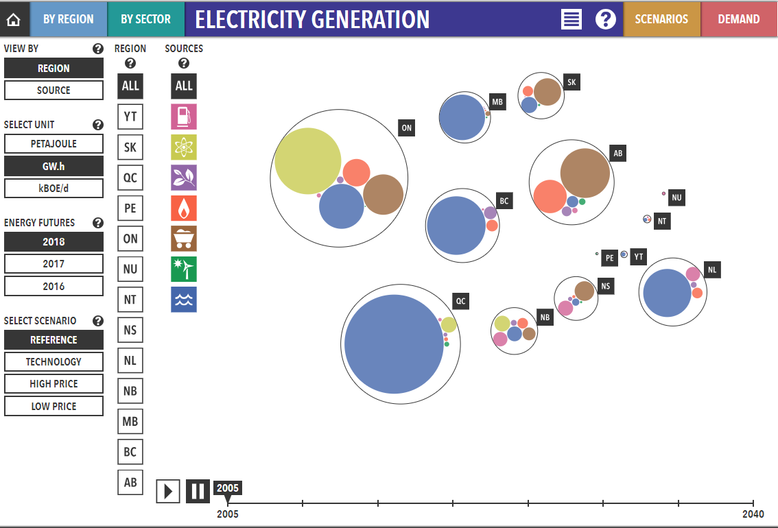
As interest in the energy story grew and interactive technology evolved, in 2016 the NEB decided to test yet another format — an interactive data visualization — using curated data from the Energy Future report. Together with the designers from the Interactions Lab at the University of Calgary, as well as specialized coders, the NEB created Exploring Canada’s Energy Future.
Our usage analytics data for 2018 show that, with over 80,000 pageviews, viewing the Canada’s Energy Future report online is the preferred medium. However, these users browse through the sections they are interested in (they look at a limited number of pages) rather than reading the entire content. The full report was downloaded in PDF form only 1,156 times. The online data appendices, with approximately 20,000 pageviews and 513 Excel downloads, were the next most popular.
We found the most popular format to be the data visualization, Exploring Canada’s Energy Future, with slightly over 130,000 page views and about 1,000 downloads in Excel format. Curated data from the Exploring Canada’s Energy Future were downloaded from the Open Government Portal 301 times.
Figure 1 plots the Canada’s Energy Future report’s various versions in 2018 against users’ data skills and format preference, based on usage data (we assumed that usage reveals behaviour patterns). We equate the use of the online database with good data skills, and we assume that those who explore the data visualization may be less skilled with data. People who read the report prefer information packaged (curated), and those who explore the data visualization are comfortable with a less scripted experience. It also seems that those who explore the data visualization acquire new skills in the process and download the curated data.
From the numbers of PDF and HTML downloads or page views of the report we might conclude that some people prefer to have the context and meaning of the data explained. From the more than 20,000 pageviews of the online appendices (database), we might conclude that there are other users who are highly knowledgeable in the energy and data sectors. But the success of the data visualization shows that giving people tools to explore data and draw their own conclusions has empowered a new group of people to engage in the energy dialogue. That is the essence of data visualization.
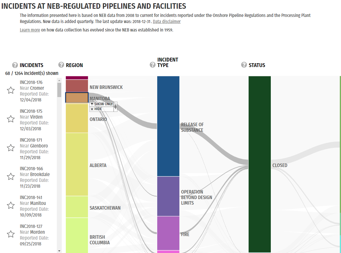
The Data Visualization Initiative has produced two more data visualizations, Pipeline Incidents and Imports & Exports of Energy Products to and from Canada.
The visualizations themselves and the increase in the audience for NEB publications are only some of the benefits of producing them. As they worked with the top-notch team of outside designers, the NEB’s subject matter experts — coders, data scientists and communicators (with mandates in capacity building) — found their perspectives changed. Being part of the creative process made them think and see differently: they discovered that if they always viewed a particular data set in the same format, they tended to lose the ability to find new insights. As an example, the economists who create the Energy Future reports now use the data visualizations to check the quality of the data sets and spot errors. Outliers are easy to see and either tell a story or reveal mistakes. It is that simple.
Perhaps the most relevant outcome of the Data Visualization Initiative, however, is the space it has opened up for a change in culture. In addition to inspiring others in the organization to come forth with new ideas and start innovative projects of their own, the NEB has deliberately retooled itself to increase enterprise-wide data and digital innovation.
Two more visualizations are in the making in 2019, which, incidentally, is the final year of the Data Visualization Initiative. The focus has now turned to how this new way of operating can be sustained. While it is early to assess success, the organization has grown in its understanding of the power of data. Although the actual initiative will be closed down, it has sparked the creation of a new business unit whose mandate is to lead the organization in its quest to increase its data-driven decision-making and enable public participation in the energy dialogue.
Next in the NEB’s digital government agenda is the redesign of the public registry of more than 300,000 scientific and legal documents that are used as evidence to adjudicate new energy projects. Currently, the public registry gets well over 1 million visits per year, primarily from individuals participating in the regulatory process. The objective is to unlock the thousands of studies on traditional knowledge and environmental baseline studies so that landowners, Indigenous people, scientists and citizens can also take advantage of the data and put them to good use. To get there, the NEB has partnered with Code for Canada in the hope of attracting talent to deliver state-of-the-art digital solutions.
The challenge of making sense of the bombardment of information is real. For users to find the path forward requires intent, imagination and, most important, designing. Digital government affords the opportunity to improve the delivery of information to the committed user base and also to reach the people who may have been inadvertently ignored.
This article is part of the Wiring Public Policy for Digital Government special feature.
Photo: Shutterstock/ By MicroOne
Do you have something to say about the article you just read? Be part of the Policy Options discussion, and send in your own submission. Here is a link on how to do it. | Souhaitez-vous réagir à cet article ? Joignez-vous aux débats d’Options politiques et soumettez-nous votre texte en suivant ces directives.